I’m a big Stephen Few fan and have learned a ton about designing graphs, tables and information dashboards from his books and his graph makeovers. But there was one makeover where I saw room for additional improvement.
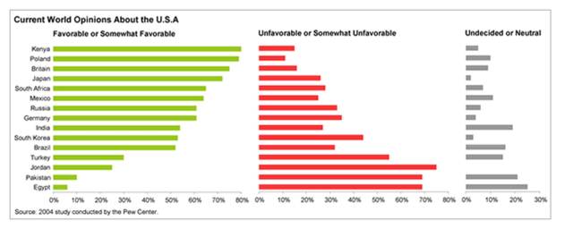
Here’s the original table, listing attitudes toward the U.S. by country. Pretty hard to read with all that duplicate text, eh?
And here’s Stephen’s makeover. It’s clearly an improvement.
However, there are two additional improvements that can be made to these graphs. First, it’s difficult for the reader to match the country names to their corresponding unfavorable and undecided bars because they are so far away. Second, it’s difficult to determine the percentage value of each bar because when your eyes flick down to look at the x-axis, you can easily lose place of the bar you were trying to measure, especially for the bars closer to the top of the graph.
Here’s three possible improvements.
1. Add leader lines. The rule of thumb is to add leader lines every 3-4 rows to give the eye a “handrail” for reading across long spaces. I’ve also added the percentage values into the ends of the bars, making the x-axis unnecessary.
2. Use shorter bars. This makes it easier for the eye to make the running leap from the country names to the “unfavorable” and “undecided” bar charts. The vertical gridlines act like handrails so the eye can find the exact percentage value.
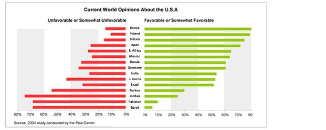
3. Create negative and positive values off a common baseline. Rather than creating separate tables for the favorable and unfavorable attitudes, combine them into one table with a shared baseline. I’ve also added very quiet gray backgrounds in 20% increments, to help the reader estimate the percentage value.
Personally, I like #3 the best. It’s visually elegant and easy to understand. The third bar chart showing the “Undecided or Neutral” values doesn’t add much meaning and can be eliminated. Which is your favorite?
About the author: Bruce Gabrielle is author of Speaking PowerPoint: the new language of business, showing a 12-step method for creating clearer and more persuasive PowerPoint slides for boardroom presentations. Subscribe to this blog or join my LinkedIn group to get new posts sent to your inbox.


Totally with you on the first 2 points – brilliant. Not so keen on the third. It’s not something I’ve heard people talk about much in data visualisation, but I strongly dislike bar graphs that run from right to left – I find it very unnatural.
That’s very interesting, Mark. Actually, film-makers are aware that we find it unnatural to read right to left. That’s why they’ll often have the bad guy enter the scene from the right while the good guy enters from the left. Sub-conciously, we know something feels unnatural when the bad guy moves into the scene.
That’s why I like putting the negative values right to left – I want the audience to feel the negativity. But I see your point how it feels unnatural to read that way.
Thanks for the response. Love the film-maker analogy. I guess as always, the real answer here is how useful the different layouts are to your audience. If you’re making these charts for a select audience (e.g. reporting), you could always ask them which they prefer.